6th January 2020: Percentage changes added to help monitor trends
Published: Mon 6 Jan 2020
Published: Mon 6 Jan 2020
Within the organisations page, you can now see the total change of output over a selected time period in the table and you can also see year-on year change in the trend graph.
For example, if you search for University of Technology Sydney, you can see that there is a new percentage change column which shows the difference between the total article output in 2018 and 2013. You can see here that University of Technology Sydney has a 133.44% change during this period. If you adjust the time range at the top of the page on the right-hand side, the graph and table will automatically update to match your selected start and end years.
You can re-order your results by ascending or descending percentage change by selecting the ‘% change’ heading at the top of the column. This can help you identify which organisations have the fastest growing output.
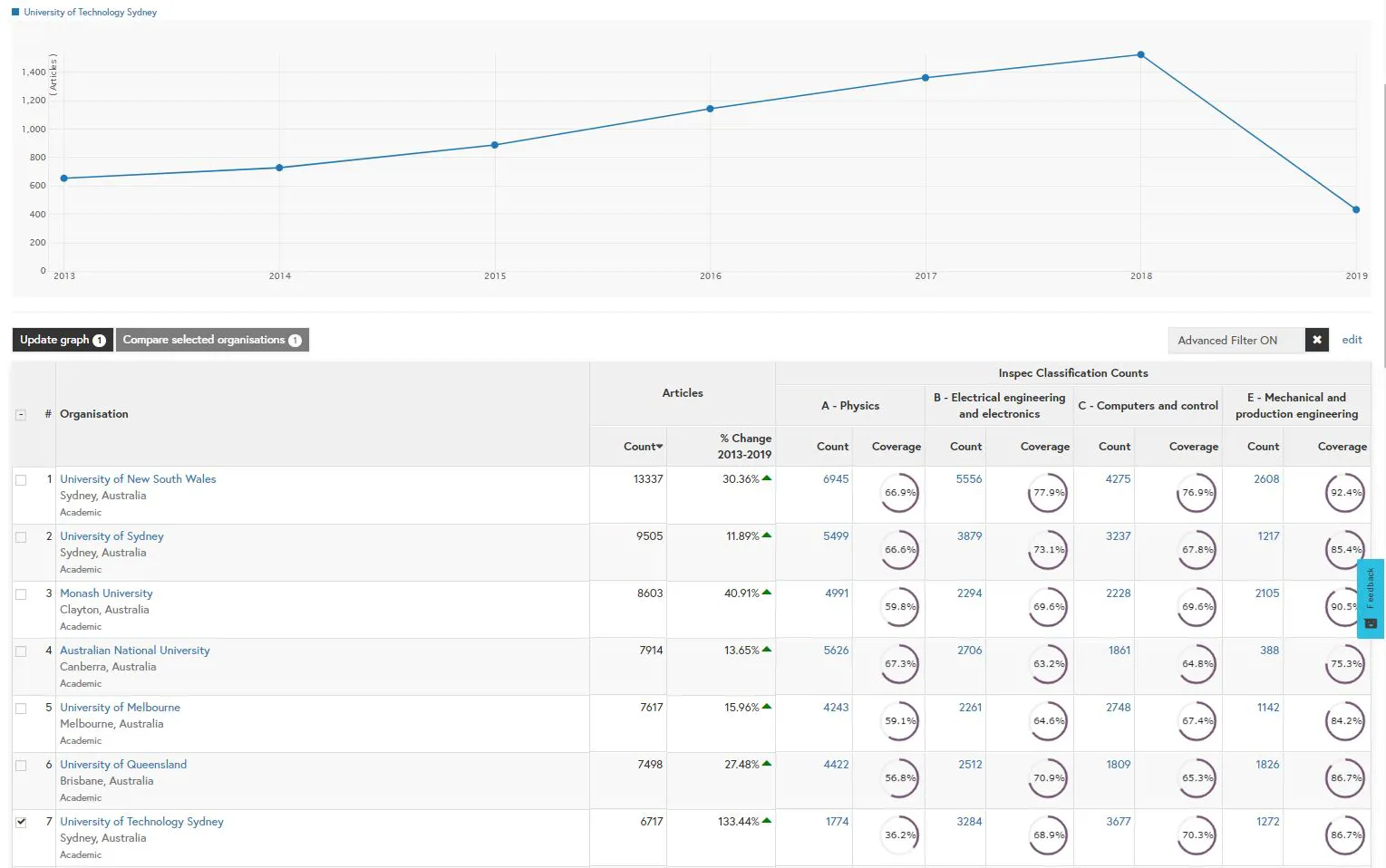
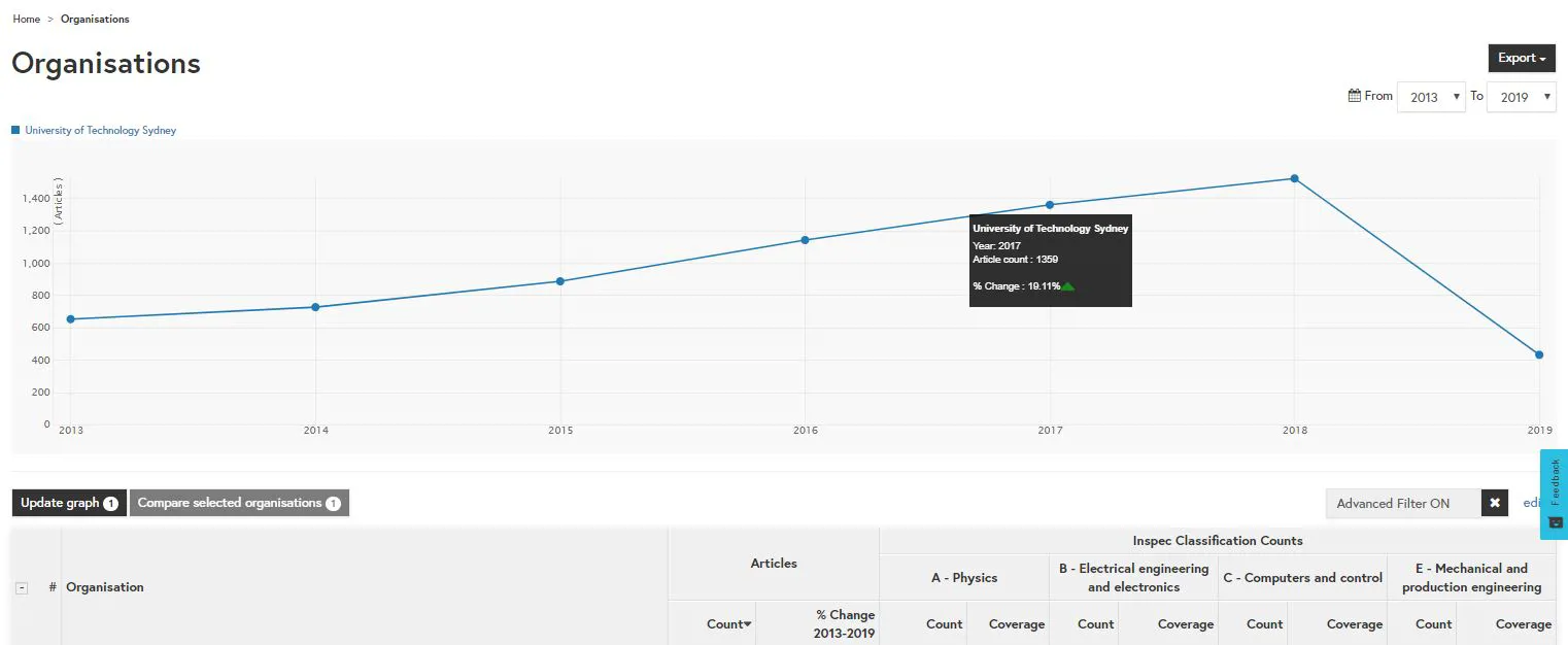
If you hover over the points in the trend chart at the top of the screen, this displays the percentage change for that specific year compared to the previous year. This feature allows you to easily compare a year-on-year growth or decline.
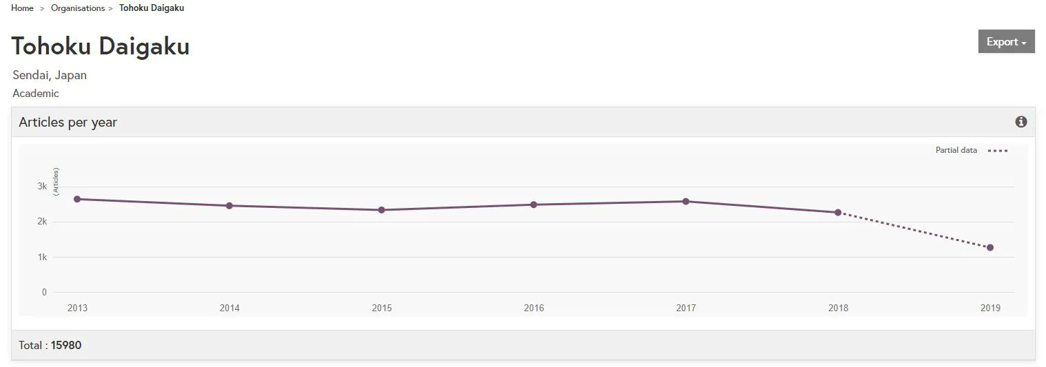
The total percentage change is also listed on the organisation profile for the organisation.
Similarly, within the controlled terms page, you can now see the total percentage change of output over a selected time period in the table and you can also see year-on-year change in the trend graph.
You can re-order your results by ascending or descending percentage change by selecting the ‘% change’ heading at the top of the column. By selecting a number of controlled terms you can easily compare the growth of global research output to identify emerging and declining fields.
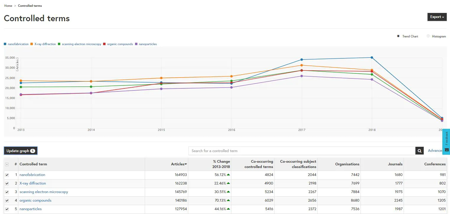
The total percentage change is also listed on the concept page for each topic.
We have also added percentage change column within the subject classification page, so that you can see the total change of global research output for each subject from 2013-2018 displayed in the table.
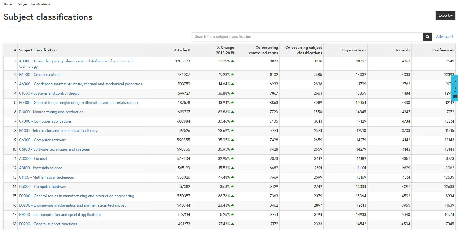
The total percentage change is also listed on the concept page for each topic.
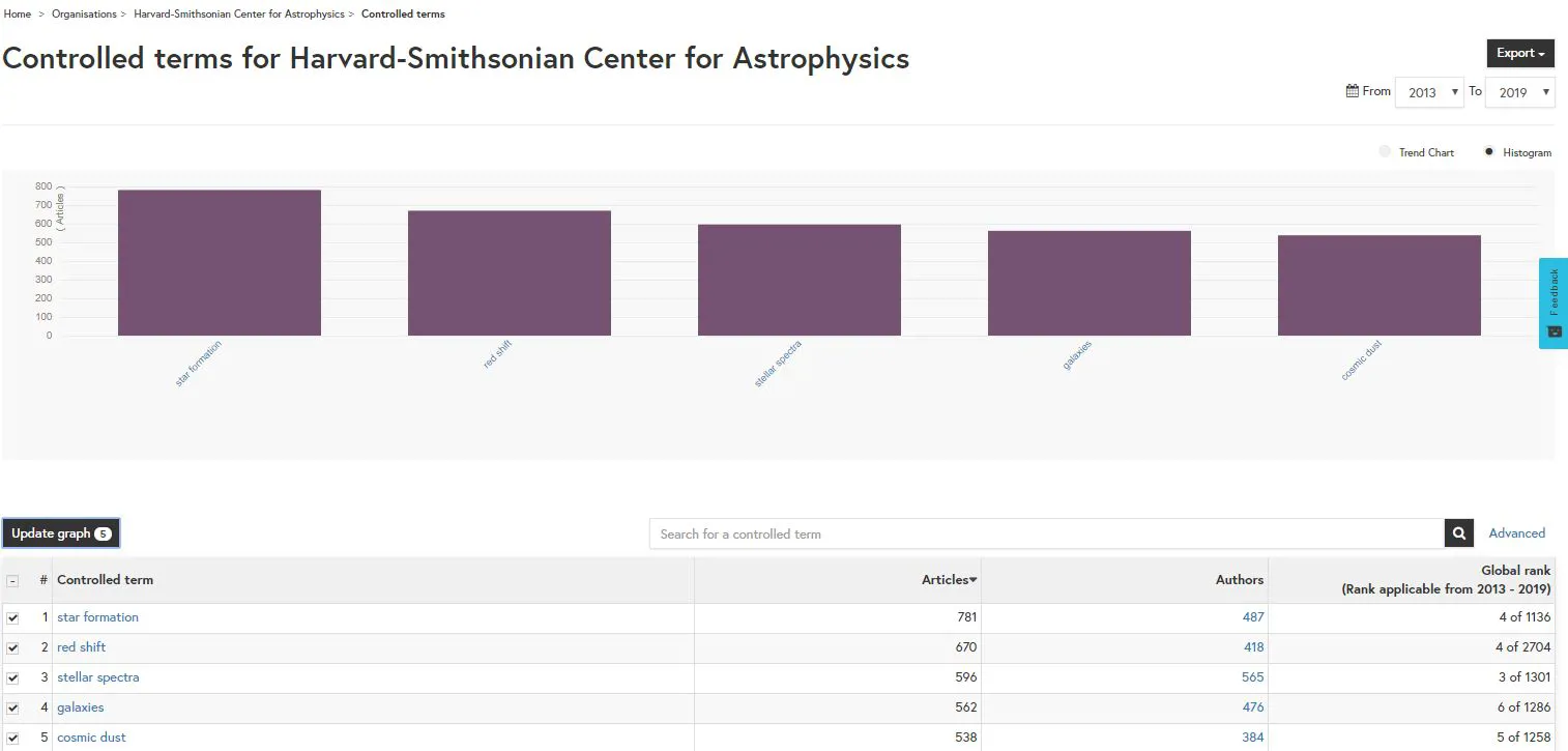
We have also made some additional updates to the visualisations in Inspec Analytics. You can now see controlled terms for an organisation as a histogram chart as well as a trend chart.
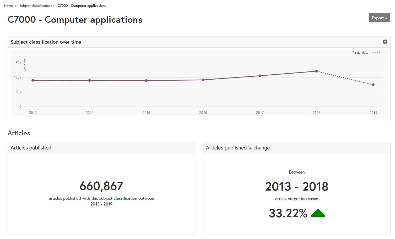
Additionally, across Inspec Analytics, you’ll notice a new dotted line in most of the line graphs. This dotted line indicates that the figures are based on partial data for articles published in the current year and are likely to change as new publications are indexed.